April 7, 2015 by danielsaniski
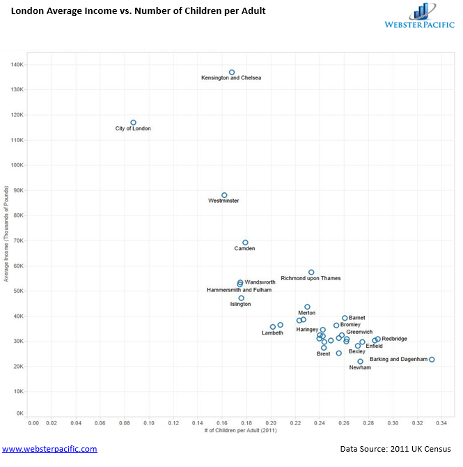
London has highly concentrated wealth in its central boroughs, with average incomes in Kensington and Chelsea and the City of London at £137,000 and £117,000, respectively. Barking and Dagenham has the lowest average income: £22,800. Income in London is highly, inversely correlated with the number of children per adult. Barking and Dagenham has almost twice the number of children per adult (.33) compared to Kensington and Chelsea (.17). While the idea that wealthier families have fewer children has been extensively studied, the scale of difference here is quite striking.
–Source: 2011 UK Census
–Created by: Staff at Webster Pacific

Tags: Children, Family Size, Income Distribution, London
Posted in Data, Demographics, Income Distribution, Maps, Visualizations | 15 Comments »
March 27, 2015 by saqibanajam
When it comes to wealth and Miami-Dade County, it’s all about the coast. The greatest density of wealth is found in Miami along all the coastal areas, with the following exceptions: the area due North of Edgewater (5) up to Aventura (30) and Sunny Isles Beach (28), as well as the area South of Palmetto Bay (81).

 — Source: ACS
— Compiled by: Staff at Webster Pacific
Tags: Dade County, data, data visualization, income, Income Distribution, Miami, Miami-Dade, Wealth Distribution
Posted in Data, Demographics, Economy, Income Distribution, Visualizations | 23 Comments »
March 20, 2015 by saqibanajam
While the districts of Xicheng and Dongcheng represent the core of Beijing and have real estate prices on par with many of the most expensive cities in the world, the part of Beijing with the greatest percentage of people with a college degree is in Southeastern Haidian District, where most of the top-tiered universities, like Tsinghua University, Peking University and Renmin University of China, are located. Certain sub-districts in Chaoyang, where most Fortune 500 companies and expatriates live, also have a higher percentage of college-educated population compared with other areas.


— Data Source: Beijing Population and Census Data
— Compiled By Staff at Webster Pacific
Tags: Beijing, data, data visualization, Educational Attainment
Posted in Data, Demographics, Economy, Income Distribution, Visualizations | 19 Comments »
March 3, 2015 by saqibanajam
What neighborhood has the highest average income in the City of San Francisco? Surprisingly, it’s not the well-known neighborhoods in the Northern part of San Francisco like Pacific Heights, Presidio Heights, Cow Hollow or the Marina. It’s actually West Twin Peaks and Noe Valley, both in the Southern part of the city. We would surmise this has something to do with the explosion of wealth in Silicon Valley and the desire of dot-commers to live in San Francisco. Worth noting is Portrero Hill and Bernal Heights, also in the Southern part of the city and also with significant average income.
Of course, if you go North to Marin or South to San Mateo County, you will find neighborhoods with substantially higher average incomes.

Image 1 – San Francisco, Marin & San Mateo Average Income Map

Image 2 – San Francisco Area Census Data
— Data Source: ACS (American Community Survey)
— Compiled by: Staff at Webster Pacific
Tags: data, data visualization, Economy, Income Distribution, Marin, Neighborhood Map, San Francisco, San Mateo
Posted in Data, Economy, Housing, Income Distribution, Maps | 4 Comments »
February 20, 2015 by danielsaniski


Since 1989, the percentage of Americans has increased from 3% to 38% today. In addition, around 14,000,000 passports were issued in 2014, compared to less than 4,000,000 in 1989.
–from dadaviz.com
Tags: America, passports, travel
Posted in Data | 1 Comment »
February 4, 2015 by saqibanajam

According to Economic Policy Institute, the Northeastern United States holds the highest share of the top 1% income, followed by the West Coast. The Midwest holds the lowest share.
–Source The Economic Policy Institute
Tags: data, demographics, Economy, income inequality, Top 1%
Posted in Data, Demographics, Economy, Inequality | 4 Comments »
January 21, 2015 by saqibanajam

The US federal government’s investments as a percentage of GDP is decreasing over time. This decrease is observed for both Defense and Non-Defense related things like roads, education and R&D.
–Source: The New York Times
Tags: Economy, GDP
Posted in Data, Demographics, Economy, Education, US Politics | 1 Comment »
January 5, 2015 by danielsaniski

This chart shows the growth of real income growth (y axis) against percentile of global income distribution. While the middle classes of emerging markets have seen enormous gains in the past generation, Western middle class incomes, including the US, have significantly stagnated in comparison.
–from the New York Times
Tags: income, Inequality, middle class
Posted in Economy, Inequality | 3 Comments »
December 16, 2014 by danielsaniski

Americans have 40% less net worth than before the recession, dropping from a median $135,700 in 2007 to $81,400. White households lost 26% of their net worth. Black households fared much worse, with their median net worth dropping 43%, while the median Hispanic-American household’s worth dropped 42%.
–from MarketWatch.com
Tags: America, Inequality, wealth
Posted in Inequality, investments, US Macro | 4 Comments »
November 26, 2014 by saqibanajam

Graduates across all majors have similar loan amounts after graduation However, payment is a heavier burden for students who graduate with degrees in arts, sports, or humanities. After graduation, salaries increase by an average of 65% in the first five years. However, non-career-oriented degrees start at much lower wages (x axis in the chart above) and thus pay a significantly higher percentage of their income in loan payments.
–from The Atlantic
Tags: college, student loans, university
Posted in Education, Inequality | 17 Comments »


